online

Analysing a text: Social Media & News

Source: mashable.com

For this post, I’ll be analysing a report from the Pew Research Center, entitled “8 Key Takeaways about Social Media and News”. As the title suggests, this is a brief and to-the-point report, which observes eight trends in the relationship between News and Social Media, based on research conducted by the Pew Research Center. The Research Center is a reputable “fact tank that informs the public about the issues, attitudes and trends shaping America and the world”, and conducts thorough research into many areas, including media.

The report is quite easy-to-read, due to the use of graphics, accessible language (avoiding excessive jargon) and brevity. Its audience would include academics, industry professionals, media students (me!) and other interested parties. Its simplicity means it could be useful for the average person who has an interest in the news and social media, as well as more serious researchers.

The information presented is objective, setting out to inform rather than persuade. While it brings up some much-debated news issues (US gun laws and same-sex marriage), it does not comment on the issues themselves, rather how they were discussed and reported in social media. The use of third-person contributes to this sense of objectivity.

All the data presented is from research conducted by the Pew Research Centre – hardly surprising given the organisation’s name and function. However, this could potentially have the opportunity for bias – for example, if the organisation had an agenda they could subtly use it in the way they conduct all their research. But I doubt that is the case, and the organisation’s reputability would reinforce this.

The data used as proof to the trends is largely qualitative, which also contributes to the report’s brevity and clarity.

One of the graphics used in the report – clear and simple.

As the title suggests, the report is split into 8 sections, each containing some text and a graph of some kind. This allows the authors to communicate the trends in a clear, authoritative and effective way. The list of trends is not in any recognisable order, apart from the first being the most general, “News has a place in social media – but on some sites more than others”, before the report proceeds to look at some social networking sites specifically and the specific activities of online news consumers.

I personally found the report very informative and useful, particularly as my group research project is going to look at the ways media students access news. I’m particularly interested to see how much social media plays a part in students’ consumption of the news, and the trends presented so clearly in this report will I think form an important part of our literature review. In comparison to the other research and articles I have so far come across, this has been the most useful and one of the most accessible, and I am looking forward to seeing how the news consumption habits of Wollongong Media students might compare to that of the general American public, as surveyed by the Pew Research Center.

Another of the graphics used – the percent of US adults who use each social networking site and the percentage of those who get news from them.

BCM210 Blog 2: In Which I Analyse A Media Research Text

Source: picjumbo.com

Source: picjumbo.com

The text is a recent report produced by the Australian Communications and Media Authority, (ACMA) the government organisation which regulates “broadcasting, the internet, radiocommunications and telecommunications”, entitled ‘Supply & demand: Catch-up TV leads Australians’ online video use.’

The report attempts to investigate how Online Video Content is used in Australian households, as it is expected to change the landscape of Australian media consumption, particularly as new services such as Netflix and Stan arrive in Australia.

As the text is written and published by the research arm of the ACMA, the authors are qualified to write on this subject from a relatively objective viewpoint, and the information is presented as such. It generally aims to stick to reporting the facts, sometimes making deductions from them, but when this occurs it qualifies the fact that these are predictions only – for example, “the availability of this service may further encourage consumers to view television….”

I think the audience includes academics, industry workers and those of the general public who have a particular interest in media. As a media student, that includes me!

The report references previous research, including a Nielsen Multi-Screen report and Choice Magazine’s research. While they are put in some sort of context (e.g. “In 2013–14, 82 per cent of ABC4Kids iview content was viewed using a mobile device” references the year the statistics were from), on the whole it simply states the facts and then footnotes the source. Presumably this was in the interests of condensing the report, but it does mean that readers are not warned of any possible biases.

The proof used to defend the conclusions made at the end of the text are mostly statistical, but they are taken from both the ACMA research and other sources, in order to strengthen the validity of the conclusions reached.

The statistics broadly cover two areas – what media is on offer to Australians (supply), and what is being consumed (demand).

One of the infographics for the report. This illustrates the time Australians spend per month viewing video content on different devices.

One of the infographics for the report. This illustrates the time Australians spend per month viewing video content on different devices.

The report features a mix of text and infographics, the graphics being used to break up the text and thus make it more accessible and readable to the audience. In terms of structure, the report starts broad and ‘zooms in’, beginning with what devices Australians are watching video in, before examining part of this – Online Video Content in more detail. I think it has been presented in this order to make it accessible, meaning that journalists, researchers and those with a professional interest in the research could scroll to the appropriate section that interests them – a practice made easy by the use of sub-headings.

The text is written in quite formal third person, reinforcing the authenticity and validity of the research. It uses some jargon, meaning readers would have to have some idea of the media landscape, but does explain some terms, product names, and acronyms, such as “over-the-top (OTT) services”.

The text generally agrees with other research on the same / similar topics – that online video viewing is becoming more common, and will continue to become more popular in the future, although it has a long way to go to catch up to television.

If writing for the ACMA, I would have to write objectively and only make deductions when clearly backed up by research.  I would also have to write formally but accessibly, using graphics to reinforce the observations and also give variety to the way it is presented.

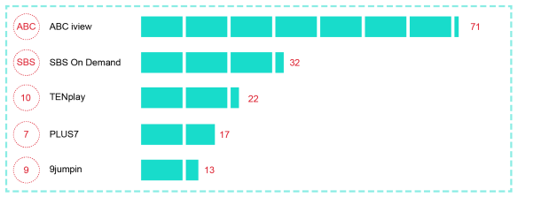
One of the infographics for the report. This illustrates the percentage of catch-up users who visit the most popular websites.

One of the infographics for the report. This illustrates the percentage of catch-up users who visit the most popular websites.